Introduction
Color is all around us, shaping our perceptions, emotions, and even our decisions. Whether we know it or not, color plays a significant role in our lives. Understanding the fundamentals of color theory can empower us to use color more effectively in various aspects of our lives, from art and design to marketing and branding. In this blog post, we’ll dive deep into the basics of color theory, exploring its history, the color wheel, color harmony, and the psychology of color.

The History of Color Theory
To truly appreciate color theory, it’s essential to understand its historical context. The Egyptians and Greeks were among the first to study color and its effects. However, Sir Isaac Newton revolutionized our understanding of color in the 17th century. Through his experiments with prisms, He showed that white light can be separated into various colors, creating the foundation for modern color theory.
The Color Wheel
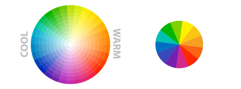
The color wheel is an essential tool in color theory. It is a circular diagram that organizes colors logically and visually pleasingly. The primary colors—red, blue, and yellow—are positioned equidistantly on the wheel. Mixing these primary colors in various combinations creates secondary colors: orange, green, and purple. Tertiary colors, such as red-orange, yellow-green, and blue-purple, result from mixing a primary color with a neighboring secondary color.

Understanding the color wheel allows artists, designers, and anyone interested in color to create harmonious color schemes and convey specific emotions through their work.
Color Harmony
Color harmony refers to the pleasing arrangement of colors that work well together. Achieving color harmony involves selecting colors that complement each other and create a visually appealing composition. There are several methods to achieve color harmony:

- Complementary Colors : Complementary colors are located opposite each other on the color wheel. When paired, they create contrast and make each other appear more vibrant. For example, red and green or blue and orange are complementary pairs.
- Analogous Colors : Analogous colors are situated next to each other on the color wheel. They share similar hues and create a sense of unity and harmony. For instance, yellow, yellow-green, and green form an analogous color scheme.
- Triadic Colors: Triadic color schemes involve selecting three equidistant colors on the color wheel. This approach creates a balanced and vibrant composition. An example of a triadic scheme would be using red, blue, and yellow.
- Split Complementary: In a split complementary color scheme, you select the two colors adjacent to their complement instead of choosing the direct addition of a color. This approach provides contrast while maintaining harmony.
- Monochromatic Colors: Monochromatic color schemes use variations of a single color by adjusting its hue, saturation, or brightness. This creates a subtle, elegant, and harmonious look.
The Psychology of Color
Understanding the psychology of color is invaluable in fields like marketing, interior design, and branding because colors can evoke emotions and influence perceptions. Here are some common associations with colors:
- Red: Red is often associated with passion, energy, and excitement. It can also convey danger or urgency. Red is frequently used to grab attention.
- Blue: Blue is linked to calmness, trust, and professionalism. It is a popular choice for corporate branding and interior design.
- Yellow: Yellow is often associated with happiness, optimism, and energy, but it can also represent caution. It’s a color that is frequently used to create a cheerful atmosphere.
- Green : Green symbolizes growth, health, and nature. It is commonly used in eco-friendly and organic branding.
- Purple: Purple is often associated with luxury, creativity, and spirituality and conveys elegance and sophistication.
- Orange: Orange represents enthusiasm, warmth, and creativity. It can grab attention and evoke a sense of playfulness.
- Black : Black is often associated with sophistication, elegance, and power. It can also symbolize mystery or darkness.
- White : White signifies purity, simplicity, and cleanliness. It is often used to create a sense of spaciousness and purity.
Color theory is a vast subject
Color theory is a vast and fascinating subject that influences our lives. By understanding the history of color theory, the color wheel, color harmony, and the psychology of color, we can harness the power of color to communicate, create, and influence effectively. Whether you’re an artist, designer, marketer, or simply someone who appreciates the beauty of color, these fundamentals will help you navigate the colorful world around you with greater confidence and creativity.


