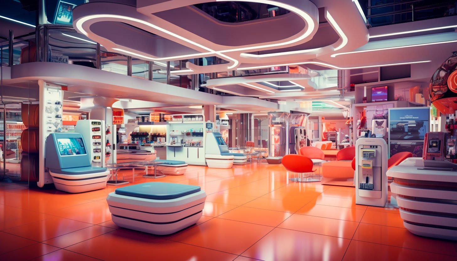
Retail world influencing customers
In retail, aesthetics play a pivotal role in influencing consumer behavior. Color is one of the most fundamental elements of creating an attractive and engaging in-store experience. Color can evoke emotions, convey brand identity, and affect purchasing decisions. In this blog post, we will explore the art of color matching in the retail environment and how it can be a game-changer for businesses aiming to leave a lasting impression on their customers.
The Psychology of Color
Before diving into the nitty-gritty of color matching, it’s essential to understand the psychology of color. Colors can evoke emotions and create perceptions, significantly impacting a shopper’s experience.
Color Matching in Store Design
Now that we’ve explored the psychology of color let’s delve into the practical aspects of color matching in the retail environment:
Brand Consistency: The colors used in your store should align with your brand identity. Consistency helps customers recognize and remember your brand.
Cohesive Design: Creating a cohesive color scheme throughout the store can enhance the shopping experience. It’s essential to consider the colors of walls, floors, fixtures, signage, and even packaging.
Contrast: Using contrasting colors strategically can draw attention to specific areas or products within the store. For example, a bright-colored product on a dark background can be eye-catching.

Color Flow: How colors transition from one store area to another should be fluid and harmonious. Avoid abrupt changes that could disrupt the shopping experience.
Mood and Emotion: Consider the perspective you want to evoke in different sections of your store. A vibrant and energetic color scheme might work well in a sportswear section, while a tranquil palette could be ideal for a wellness or spa area.
Seasonal Adaptation: Many retailers change their color schemes seasonally to align with holidays or evolving trends. This keeps the store fresh and relevant.
Technology in Color Matching
With advances in technology, retailers now have tools at their disposal to help with color matching:
1. Color Matching Software: These tools can analyze colors in images and suggest matching or complementary colors, ensuring that your marketing materials, website, and in-store displays align perfectly.
2. Digital Signage: Digital screens can display dynamic content, including color schemes, which can be adapted based on real-time data and trends.
Color matching is an art form in retail that can significantly influence how customers perceive and engage with your brand. By understanding the psychology of color and implementing effective color-matching strategies, retailers can create an unforgettable shopping experience that resonates with customers and keeps them returning for more. Whether you’re a small boutique or a large chain, the right colors can make a difference in your retail success.
The Language of Color
Color is a universal language that transcends cultural boundaries and communicates on a subconscious level. It can evoke emotions, trigger memories, and influence perceptions.
Creating Brand Identity
Regarding retail branding, color is crucial in creating and reinforcing brand identity. Consistency in color usage across various touchpoints—such as logos, packaging, store design, and online presence—helps consumers recognize and remember your brand. This consistent color association strongly connects your brand and the emotions and values it represents.
For example, think of the iconic Tiffany & Co. brand. The use of their signature robin’s egg blue, known as “Tiffany Blue,” instantly conveys luxury, elegance, and a sense of timeless beauty. This consistent color association has become synonymous with the brand itself.

Eliciting Emotional Responses
Colors can evoke specific emotional responses in consumers, which retailers can strategically leverage in their branding efforts. Whether creating a sense of excitement during a sale or promoting a calming ambiance in a spa, color association can help shape the emotional experience of shopping.
Consider the warm and inviting atmosphere of Starbucks cafes, where earthy tones of green and brown are used to create a cozy and comfortable space for customers. This color association with relaxation and indulgence encourages patrons to linger and enjoy their coffee.
Color association
Color association is a potent tool in the arsenal of retail branding. By understanding the psychology of color and consistently applying it to various aspects of your brand, you can create a powerful and memorable identity that resonates with consumers. Whether you aim to convey energy, trust, happiness, or sophistication, your chosen colors can tell a compelling story about your brand and leave a lasting impression on your customers. In the competitive world of retail, harnessing the power of color association can be the key to standing out and building a loyal customer base.


