
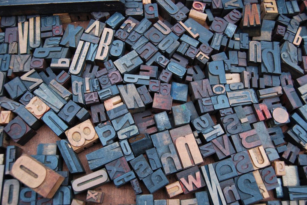
What is typography?
Typography is more than just arranging letters and words; it’s an art form that plays a crucial role in design, branding, and effective communication. To master this art, one must understand and harness the essential elements of typography. In this article, we delve into the core elements that form the foundation of typography and how they influence how we perceive and engage with text.

1. Typeface Selection
Typeface, often referred to as font, is typography’s first and foremost element. It is the visual representation of the characters we read. Typefaces come in various styles, and each type conveys a different mood and personality. Here are a few standard classifications:
– Serif: These fonts have decorative strokes or “serifs” at the ends of characters. They are considered traditional and are often associated with readability and elegance.
– Sans-serif: These fonts lack serifs, resulting in a clean, modern, and minimalist appearance. They are favored for digital content and convey simplicity and modernity.
– Script: Script fonts mimic cursive handwriting and bring a touch of elegance and sophistication. They are often used for invitations and decorative purposes.
– Display: Display fonts are bold and eye-catching, suitable for headlines and logos. They can be highly decorative and expressive.
2. Type Size
The size of the typeface, measured in points, is crucial for readability and hierarchy. Larger type sizes are used for headlines and titles, while smaller sizes are suitable for body text. Proper sizing ensures that readers can engage with the text comfortably.
3. Line Length (Measure)
The width of the text block, known as line length or measure, significantly impacts readability. Too short lines can make the text feel disjointed, while too long tubes can be challenging to follow. An optimal line length promotes efficient reading.
4. Leading (Line Spacing)
Leading refers to the vertical space between lines of text. Appropriate leading ensures that lines appear smooth and spaced out, making it easier for readers to follow the text. It plays a vital role in overall readability.

5. Kerning and Tracking
Kerning involves adjusting the space between individual characters while tracking changes the space uniformly between all characters in a text block. Both practices are essential for maintaining proper spacing and visual consistency.
6. Hierarchy
Typography helps establish a visual hierarchy within the text. This is achieved by varying type sizes, weights, and styles to emphasize certain elements. Hierarchy guides readers through content, making it easier to understand.
7. Alignment
Text can be aligned in various ways, including left-aligned (ragged right), right-aligned (rough left), centered, or justified (aligned on both left and right edges). Alignment choices impact the overall visual appearance and readability of a text.
8. Color
Color in typography extends beyond just black and white. It involves choosing text colors that harmonize with the overall design and evoke specific emotions. High contrast between text and background enhances legibility.
9. Whitespace (Negative Space)
Whitespace, or negative space, is the space around and between typography elements. Skillful use of whitespace provides balance, clarity, and breathing room in a design, enhancing readability.

10. Consistency
Consistency is paramount in typography. A consistent set of typefaces, sizes, and styles across a document or design creates a unified and professional look.
Typography
Typography is a subtle yet powerful art form influences how we perceive and engage with written content. By understanding and effectively utilizing the essential elements of typography, designers, and communicators can create visually appealing, readable, and impactful text-based materials. Typography is not merely a technical skill; it’s a creative tool that allows us to craft messages that resonate and endure.


