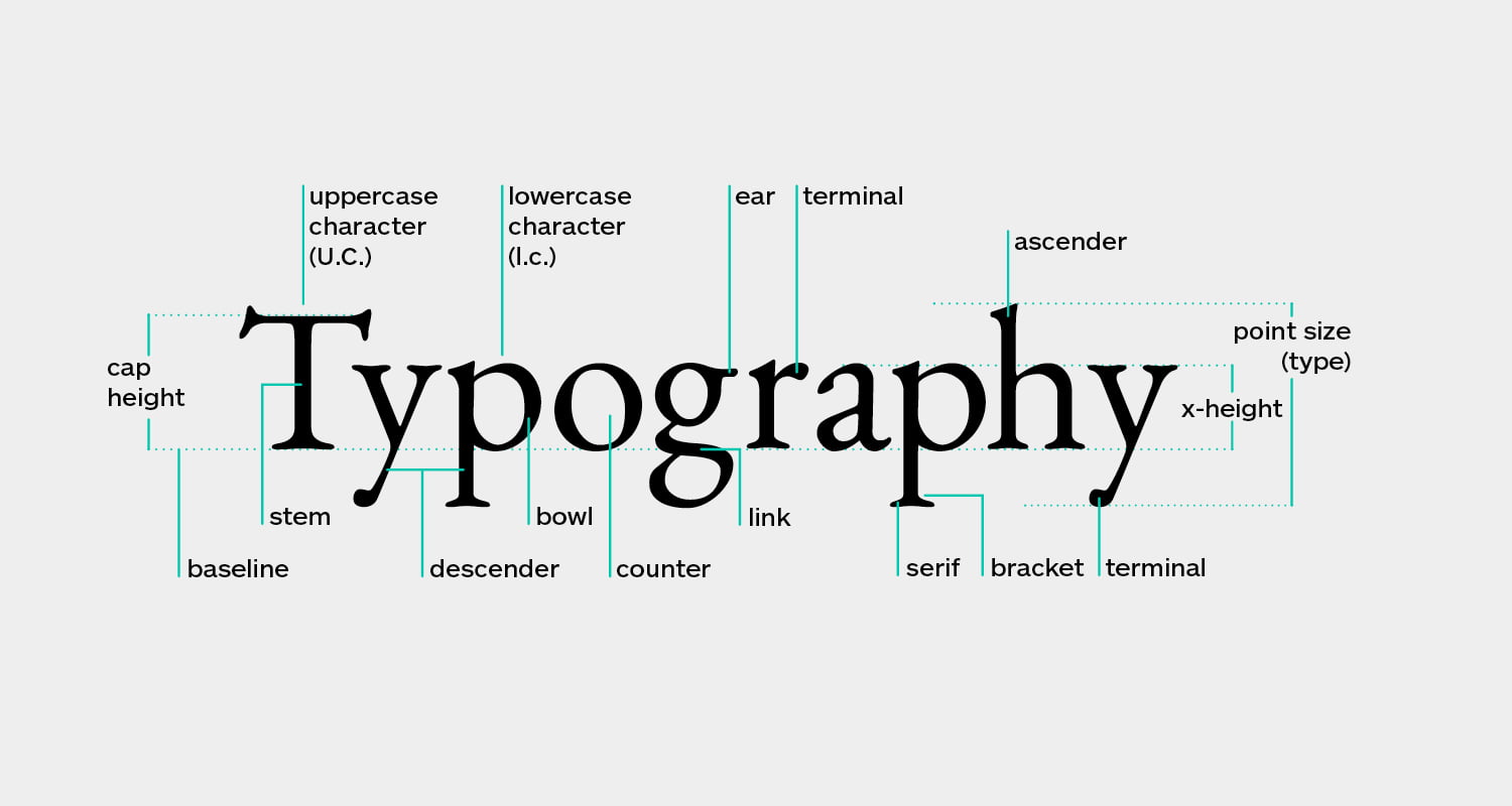
Typography, the art and science of arranging type, is pivotal in shaping a brand’s identity and communicating its essence. The silent but powerful language conveys a brand’s personality, values, and message. In this digital age, where visuals dominate the marketing landscape, understanding the usage of typography in branding is more critical than ever. This article explores the significance of typography in branding and provides insights into how it can be effectively utilized to create a lasting impression.
The Power of Typography in Branding
1. Setting the Tone: Typography is the first point of contact between a brand and its audience. The choice of typeface, style, and size instantly communicates the brand’s character. For example, a sleek, sans-serif font exudes modernity and minimalism, while a cursive script font might evoke elegance and tradition.
2. Differentiating Identity: Typography helps in brand differentiation. A unique typeface or a customized font can make a brand instantly recognizable, even without a logo. Think of the distinct typography used by brands like Coca-Cola or Disney.

3. Creating Consistency: Consistency is critical in branding. Using consistent typefaces across all brand materials—the website, packaging, or marketing collateral—builds a cohesive visual identity that consumers can quickly identify and trust.
4. Enhancing Readability: Typography also has a practical aspect. It ensures that the brand’s message is clear and legible. More carefully chosen fonts can alienate an audience and hinder communication.
Effective Typography Strategies in Branding
1. Typeface Selection: The choice of typeface is crucial. Brands must consider their target audience, values, and personality. Fonts with serifs, such as Times New Roman or Georgia, are associated with tradition and dependability. In contrast, sans-serif fonts like Arial or Helvetica are often linked to modernity and a straightforward design.
2. Custom Fonts: Many successful brands invest in custom fonts to stand out and maintain exclusivity. For example, Netflix developed its typeface, Netflix Sans, to create a distinct brand identity.
3. Font Pairing: Brands often use multiple fonts to create visual interest and hierarchy. Pairing a bold, attention-grabbing headline font with a clean, readable body font is a common practice.
4. Color and Typography: Color and typography go hand in hand. The color of the text can influence the emotional response of the audience. The combination of color and typography should align with the brand’s message and values.
5. Responsive Typography: With the rise of mobile and web applications, responsive typography is essential. Brands must select easily read and visually attractive fonts on different screen sizes and devices.
Case Studies in Typography-Driven Branding
1. Apple: Apple’s use of the San Francisco typeface across its products and marketing materials embodies simplicity, elegance, and modernity, reflecting the brand’s design philosophy.

2. Nike: Nike’s use of the custom typeface, Futura Bold Condensed, alongside its iconic swoosh logo, communicates speed, energy, and athleticism.

3. Google: Google’s clean and versatile custom typeface, Product Sans, represents innovation, accessibility, and user-friendliness.

World of branding
Typography is a powerful tool that should be considered. It communicates the brand’s personality, creates recognition, and fosters consumer trust. By carefully selecting and consistently implementing typography, brands can craft a compelling visual identity that resonates with their audience and leaves a lasting mark in their hearts and minds. Typography is more than just letters; it’s the art of visual storytelling that can transform a brand into an unforgettable experience.


