

Introduction
Chartreuse, a name that invokes images of lush green landscapes and intriguing concoctions, holds a unique place in history and culture. From a renowned liqueur created by Carthusian monks to a distinctive hue on the color spectrum, Chartreuse has left its mark in various realms. In this educational exploration, we delve into Chartreuse’s intriguing history, captivating science, and multifaceted applications.
History of Chartreuse Liqueur: A Spiritual Elixir
The story of Chartreuse begins with the Carthusian monks in the 17th century. Seeking to create a medicinal elixir, these monks developed a complex recipe of over 130 botanicals and herbs. This secret concoction eventually evolved into two versions: the vibrant Green Chartreuse and the mellower Yellow Chartreuse. The liqueur’s recipe remained closely guarded within the Carthusian order, making it one of the world’s oldest and most mysterious spirits.

Fun Facts About Chartreuse: A Taste of Intrigue
Chartreuse boasts a rich history filled with interesting tidbits. Did you know that the color “chartreuse” was named after the liqueur? This vibrant color takes its cue from the striking hue of the Green Chartreuse. Additionally, the Chartreuse liqueur’s recipe is said to be divided among two monks holding half of the secret formula, ensuring that no single individual possesses complete knowledge.
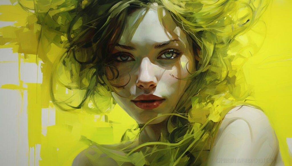
Chartreuse in Color Theory and Science: A Radiant Spectrum
The color chartreuse is uniquely positioned between green and yellow on the visible light spectrum. Its vibrant and eye-catching nature makes it popular in various fields, including design, fashion, and branding. Color theory suggests that Chartreuse exudes a sense of freshness, excitement, and vibrancy, making it an excellent choice for attention-grabbing visuals.
Chartreuse in the Printing Industry: A Splash of Creativity
Chartreuse found its way into the printing industry, bringing energy to visual compositions. The color’s ability to command attention while maintaining a balanced presence makes it a valuable asset in design and advertising. Its striking contrast against white backgrounds ensures readability and draws the eye, making it a favorite for headlines, call-to-action buttons, and logos.
Turquoise Color in the Renaissance Era: A Glimpse of History
While turquoise and Chartreuse are distinct colors, they share historical significance. Turquoise, popular during the Renaissance, represented luxury, spirituality, and prosperity. It adorned paintings, jewelry, and clothing, signifying an appreciation for aesthetics and cultural refinement during that era.
Color Psychology of Chartreuse: A Palette of Emotions
Beyond aesthetics, Chartreuse holds a psychological influence. Its lively and invigorating tone can evoke freshness, growth, and optimism. This makes it an ideal choice for brands and advertisers aiming to create a sense of dynamism and forward-thinking in their audiences.
Chartreuse in the Advertisement Industry: A Splash of Impact
In advertising, Chartreuse takes center stage for its ability to grab attention amidst the visual noise. Its inherent contrast and vibrancy make it a powerful tool for creating memorable advertisements. Chartreuse adds a dash of excitement that lingers in the viewer’s mind, from product packaging to digital campaigns.
History of color
Chartreuse, as a liqueur and a color, weaves a fascinating tapestry of history, science, and culture. From its humble beginnings in the hands of monks to its widespread presence in modern design and marketing, Chartreuse remains a symbol of creativity, intrigue, and vibrancy. Whether enjoyed in a glass or admired on a canvas, Chartreuse continues to captivate the senses and spark the imagination.


